OWN PROJECT / 2026
ID Enterprise: from identity to website.
An in-house project showing how a visual identity becomes a clear, consistent digital presence.
The brief
Present business consulting, technology, visual identity and classic car advice through one recognisable brand. Keep the website straightforward to use and maintain.
The approach
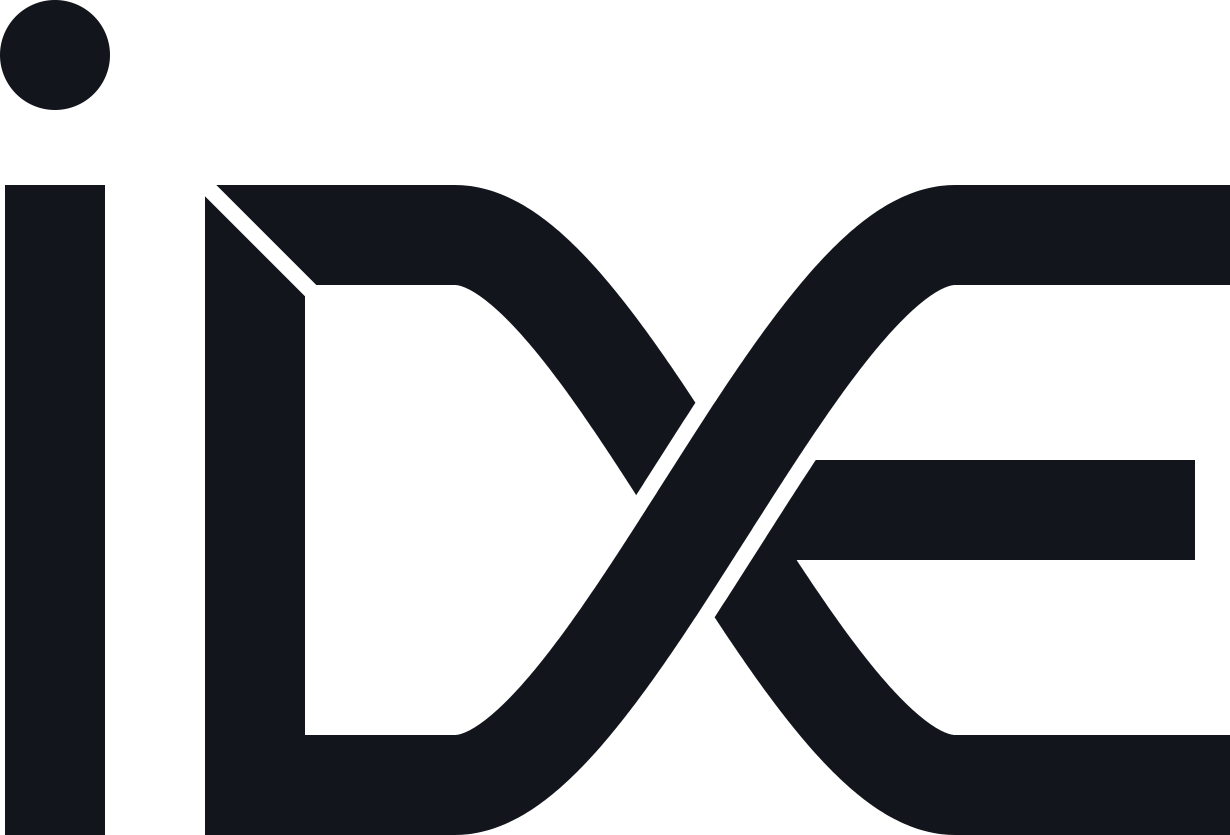
Apply the original IDE mark, the Ink / Paper / Petrol / Copper palette and the Manrope / JetBrains Mono type pairing. Use an editorial layout to distinguish business services from the personal motoring story.
What was delivered
A brand book and its website application, Croatian and English pages, a three-step collaboration process, dedicated classic car and project sections, and direct email contact. The website uses static HTML and CSS with locally hosted fonts.
ID / BRAND BOOK
Identity is in the details.
ID Enterprise was developed as a connected visual system. The proportions of the mark, colour relationships, typography and spacing are defined to keep the identity recognisable across the website, business materials and print.
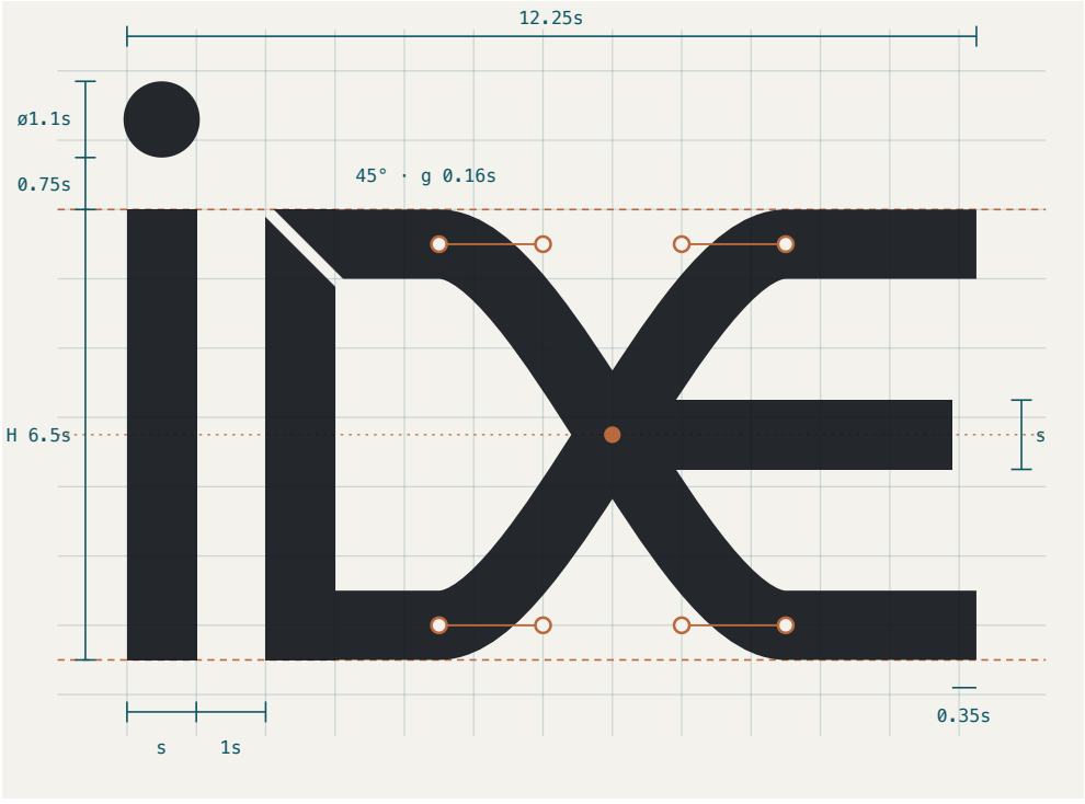
The geometry behind the mark.
A modular grid defines the proportions and the relationship between the strokes. The detail at the centre preserves the distinction between the crossing forms.
Colour with a purpose.
Ink provides the foundation, Paper creates space, Petrol carries the brand, and Copper and Steel add accents.
Two typefaces. One clear voice.
Manrope carries the main text. JetBrains Mono distinguishes labels and technical details. Consistent hierarchy and spacing connect them.
Selected details from our own brandbook. The full document brings these decisions together as guidelines for consistent use and future development.
This is ID Enterprise’s own project, not a client reference. This presentation documents the work delivered; it makes no claims about measured business results.